Sonatype Product Logo Redesign
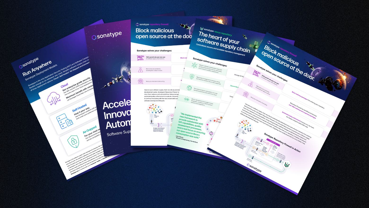
As Sonatype’s product suite grew, the logo system became fragmented and overly rigid. Many logos were created outside brand standards, and some products became more recognizable than Sonatype itself — cannibalizing brand equity. The lack of hierarchy and cohesion created confusion for users and weakened brand consistency across channels.
The Story
As Design Director, I led the strategy and execution of a scalable logo system to clarify product tiers and unify the brand. I developed the system, aligned stakeholders, and worked closely with product teams to ensure logos functioned well inside developer tools — addressing long-standing integration issues.
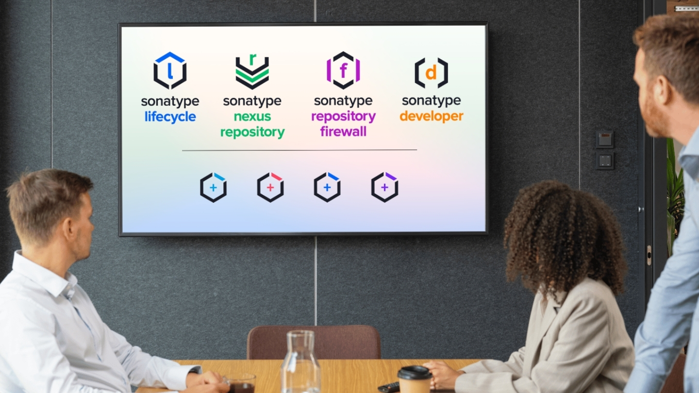
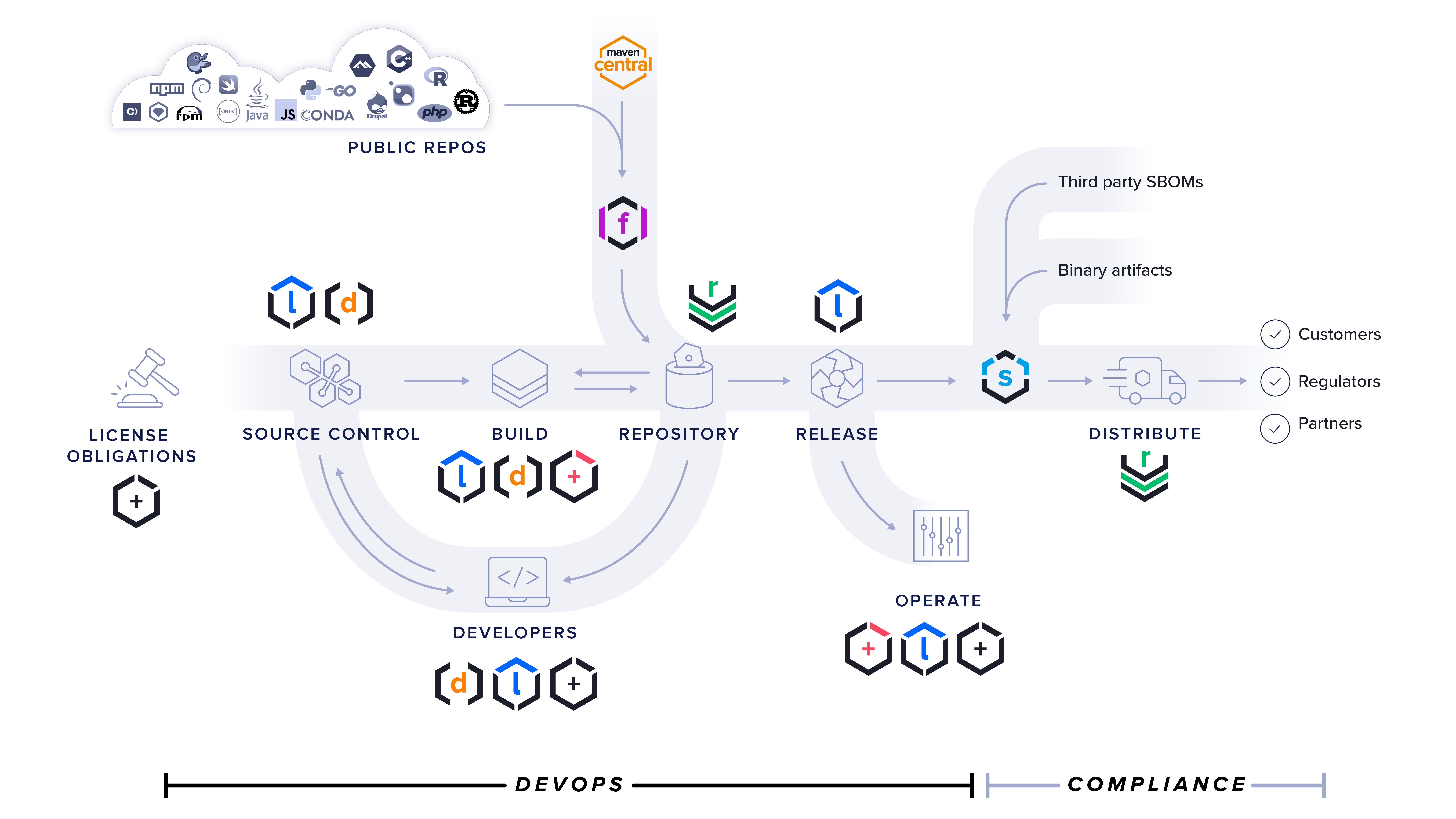
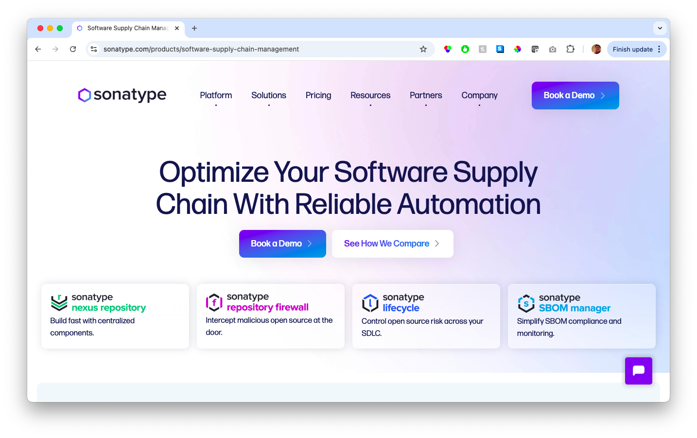
We anchored the system in Sonatype’s hexagon brand mark. Flagship products received distinct logos with subtle nods to function (e.g., brackets for Developer), while add-ons used a consistent “hex + plus” design. The system ensured consistency, visual clarity, and scalability — ready to support new launches without design debt or confusion.

The Results
- Resulted in improved alignment between marketing and product teams through shared tools and expectations
- Reduced the logo set from 8+ disparate marks to 4 flagship identities and 4 consistent add-on logos at launch
- Achieved 100% adoption across the website and product UI within the first month
- Enabled future growth: the system has already been applied to 2 new product launches
- Improved visual clarity and cohesion across the website, product interfaces, and event collateral
- Strengthened Sonatype’s brand attribution by clearly linking product logos back to the parent brand
This project reinforced the role of design systems in driving not just consistency, but clarity and strategic growth. By building flexibility into the system and collaborating early with product teams, we ensured a rollout that was both creatively strong and operationally seamless.